Britsoft
Printing a
Film
Read-Only Memory is a publisher interested in the history of video games. In early 2015 they approached us with a proposition: to transform hours of filmed interviews into a book about the early video games industry in Britain.
The interviews were the uncut material captured for a documentary film. This means Britsoft would give us the chance of revisiting a subject that always interested us, the act of translating a content from one media to another. It can be argued that graphic design is always an exercise of translation, as we’re essentially manipulating a given message. But in some projects that exercise is brought into a particularly sharp focus. Designing any cover, for instance, requires engagement with what is often a detailed universe, with its own subtleties, voice tones and complexion.

Stills from From Bedroom to Billions, documentary source of the Britsoft book
The project would also give us the chance to step in the shoes of past students of ours. A few years ago we were teaching at IUAV in Venice and we proposed to the class the very same exercise: make a book out of an existing film. We were curious to see how they would adapt a film director’s vision into a printed object. How would they represent a story that’s told in no chronological order? Or a film that has multiple main characters? Or a story told through voice over, an action film where the main bits are not in words?
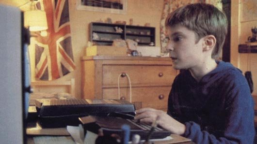
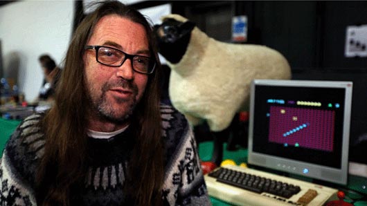
Stills from From Bedroom to Billions, documentary source of the Britsoft book
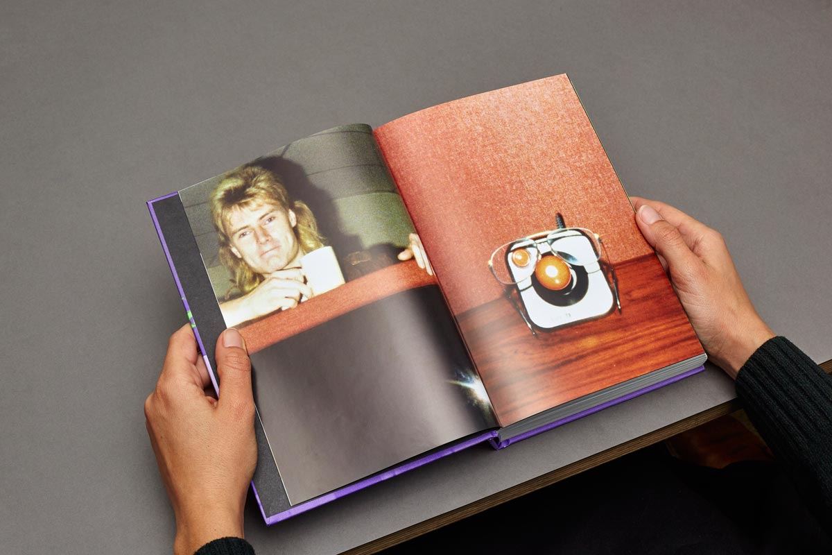
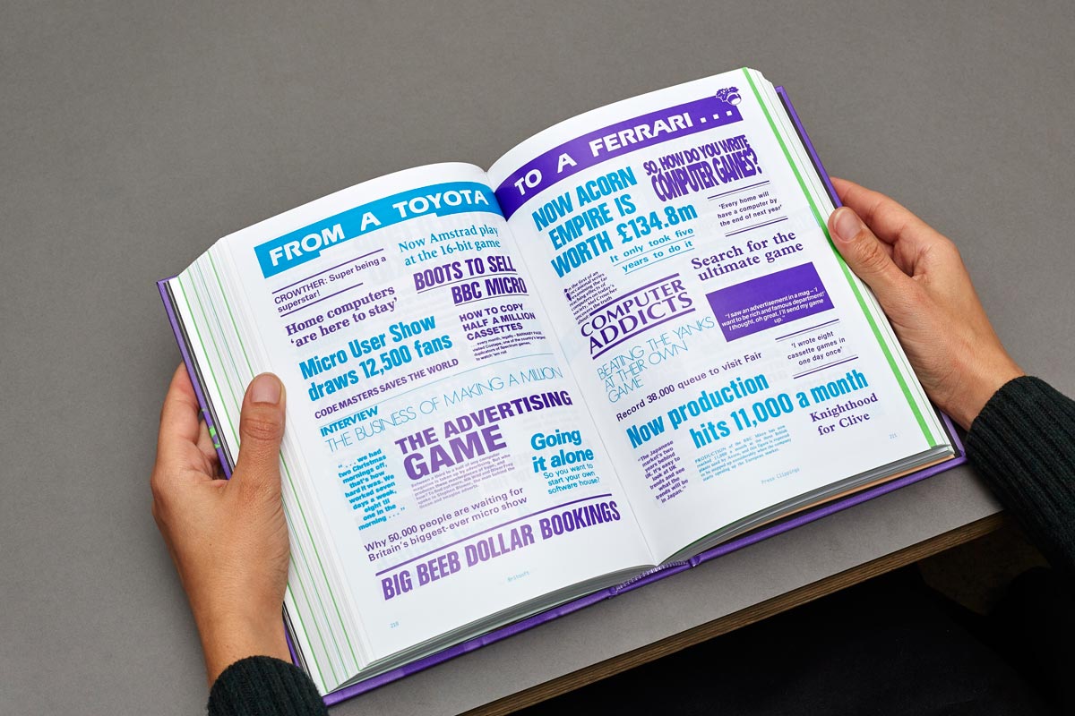
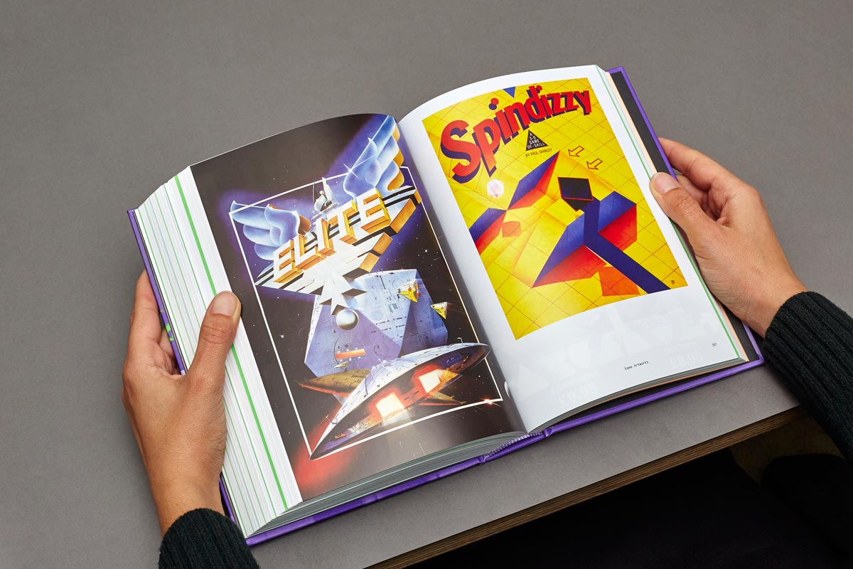
In the case of this book, there was no concern in making it relate to the original film. Rather the opposite, it was intended to have its own life. That said, we were working with the same material: hours of interviews plus hundreds of photographs, game screens and press clippings.
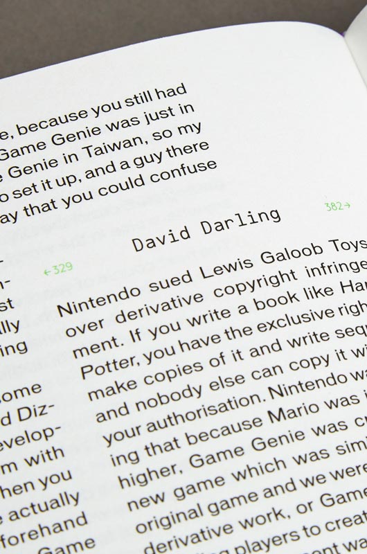
There was to be plenty of text in the book, and we were conscious that differently from a film, a book is probably not read all at once. Our intention was to help readers find entry points in virtually any page. We were also keen to represent the parallel narratives, organising the book through subjects rather than speakers. For instance, if a subject was discussed by different people, we’d cluster these people together. If a speaker was making a counter-point to another, we’d place them side by side.
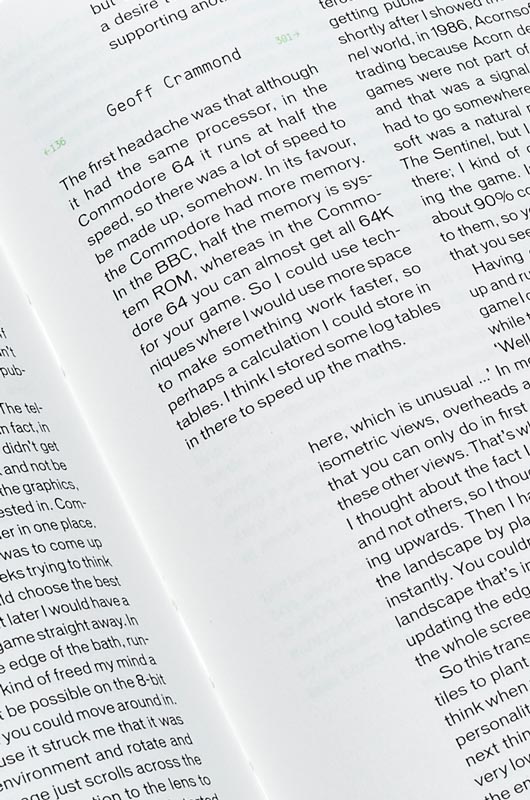
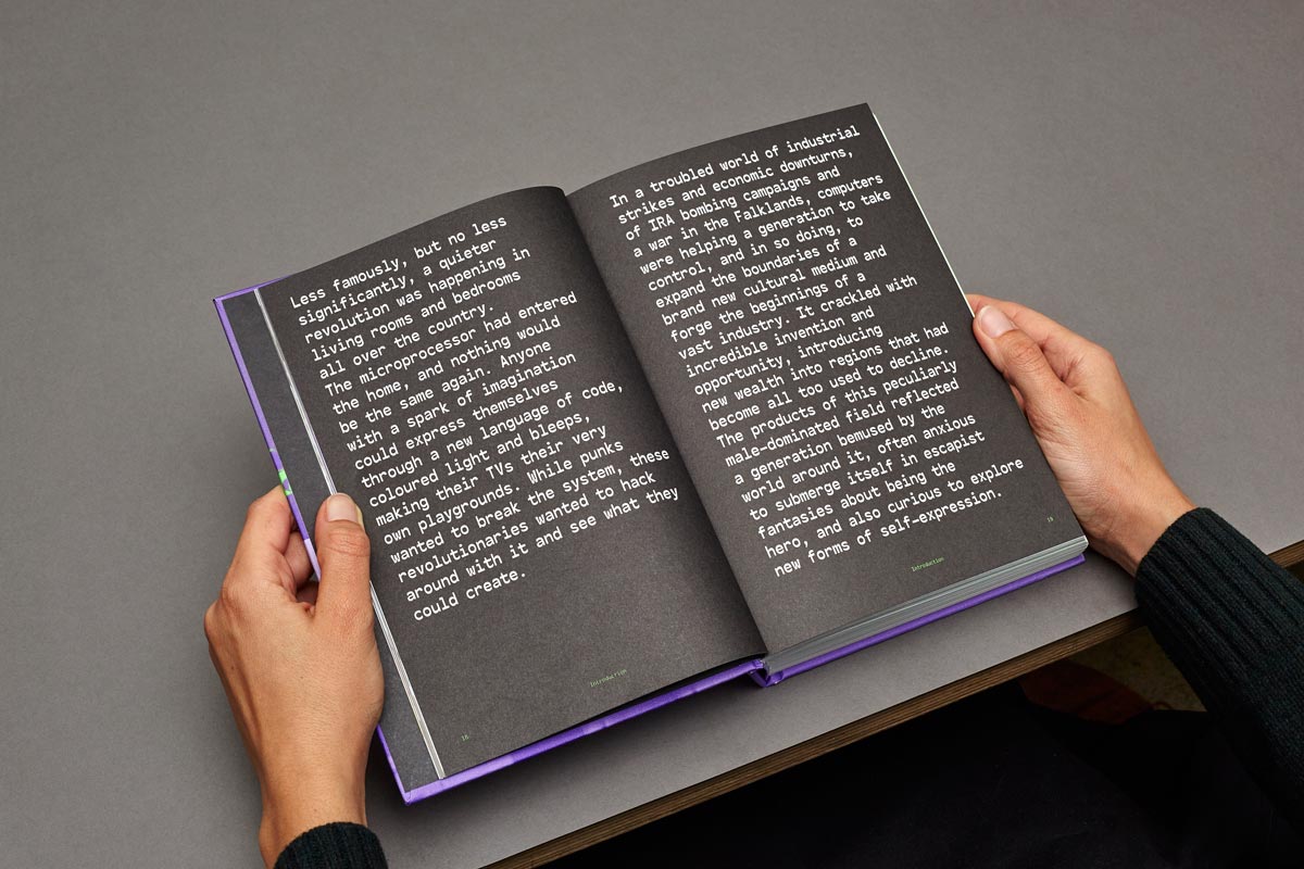
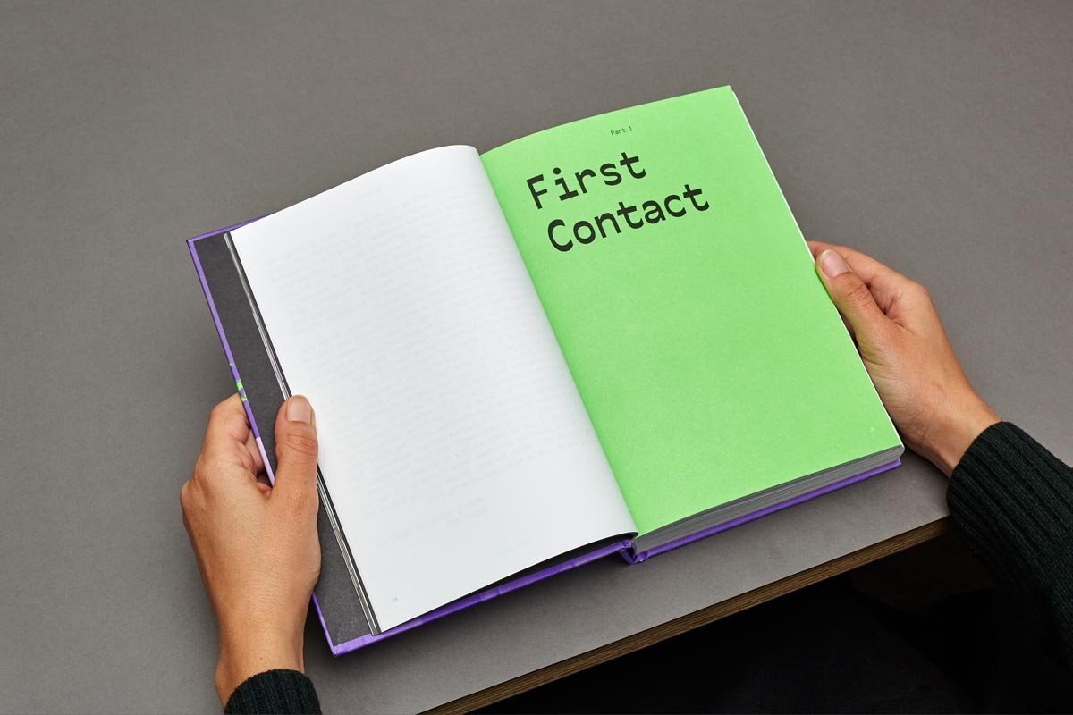
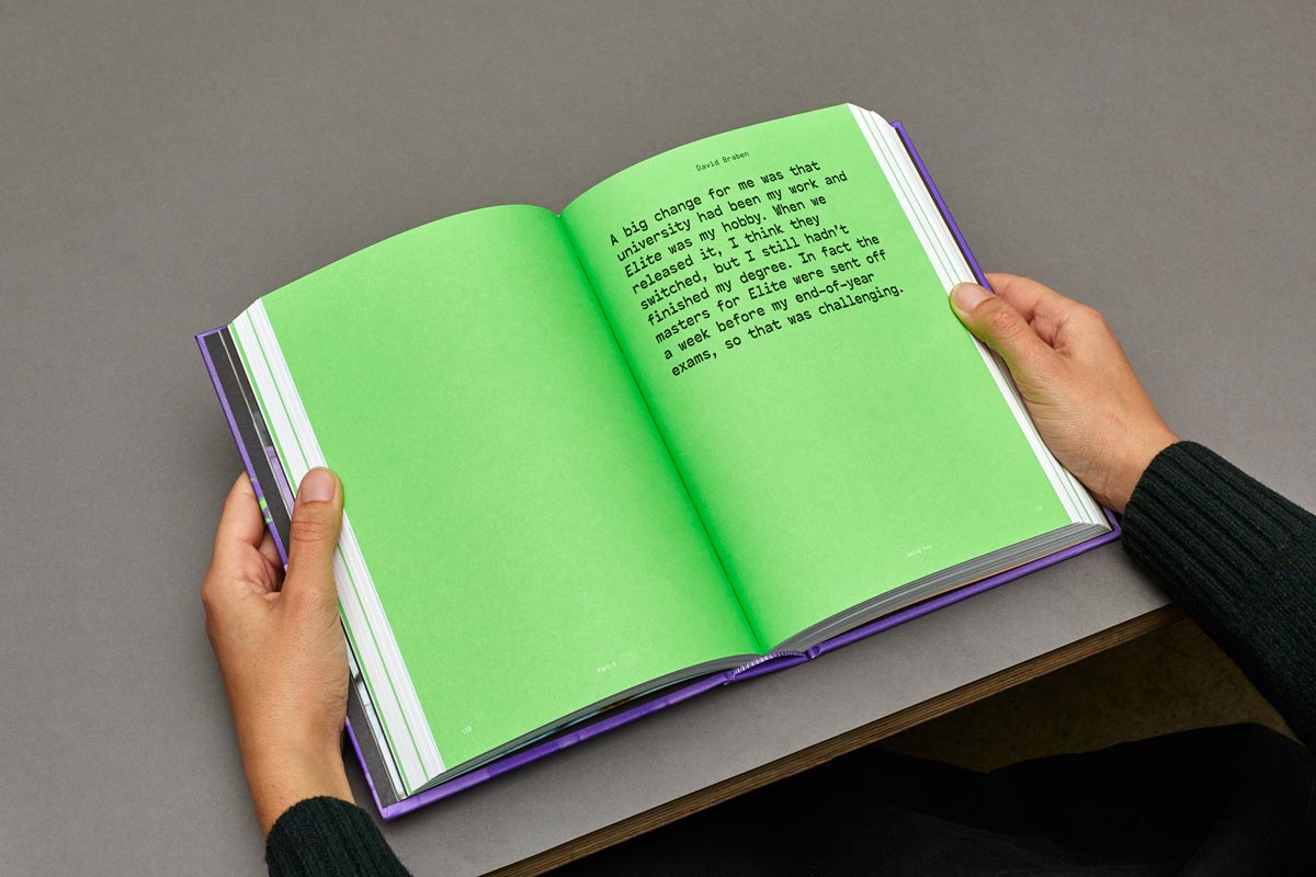
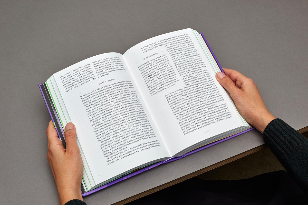
This means that a speaker’s story is broken up in multiple parts, spread chronologically through the book. It avoids a return to the early years every time a new interviewee is presented, so they all contribute in creating one big narrative. This collage of extracts isn’t the only way of reading the book: page markers indicate where an interviewee resumes his story, so the reader may also follow it in a linear way. Editor Alex Wiltshire and publisher Darren Wall were fundamental in implementing this way of working. Our most cohesive and interesting work comes out of collaborations where everyone is pulling in the same direction, and Britsoft just reinforces that impression.

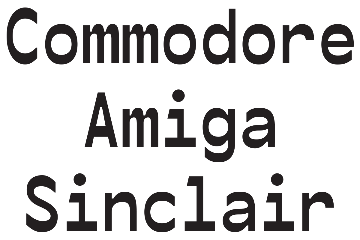
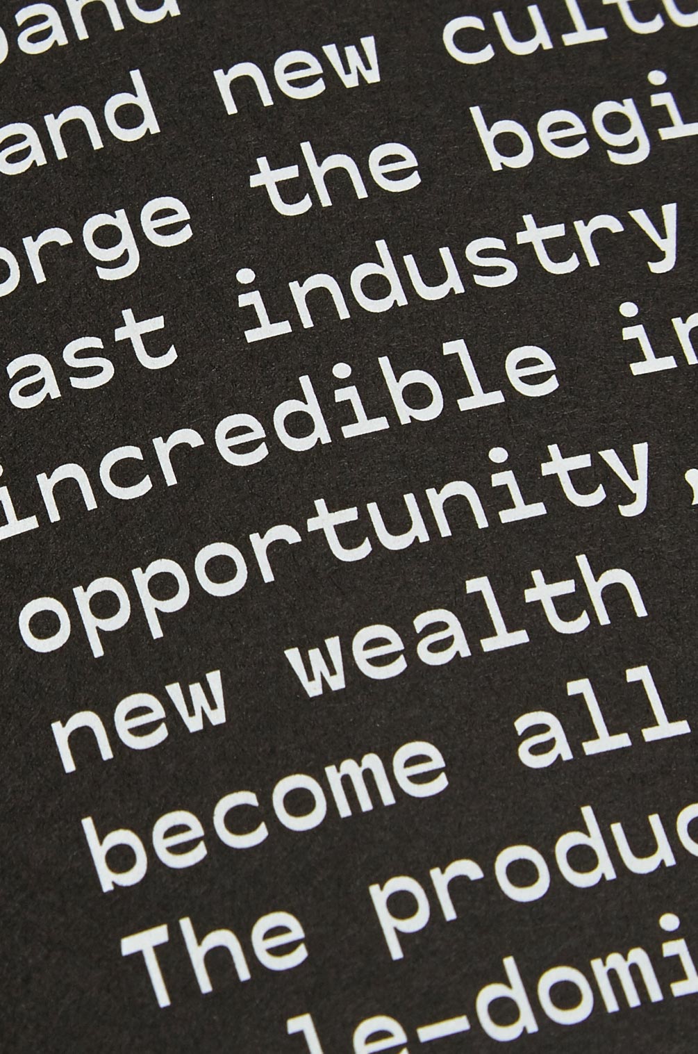
Whenever possible we like to design a typeface for our projects. Sometimes this is born out of necessity, as typefaces help us solve certain problems. In other cases it’s a question of adding a level of detail and authorship over the final piece. In Britsoft’s case it was a bit of both. Considering that the book is not about playing games but coding them, it was appropriate to use a monospace typeface (the standard choice for programming software).
The difficulty is that most monospace typefaces are not designed to be printed in large body size, so we designed our own. Its appearance is based on the way old VGA monitors displayed type, making horizontal lines look thicker than vertical ones. These old monitors are also the inspiration behind the colours green and black on text pages.
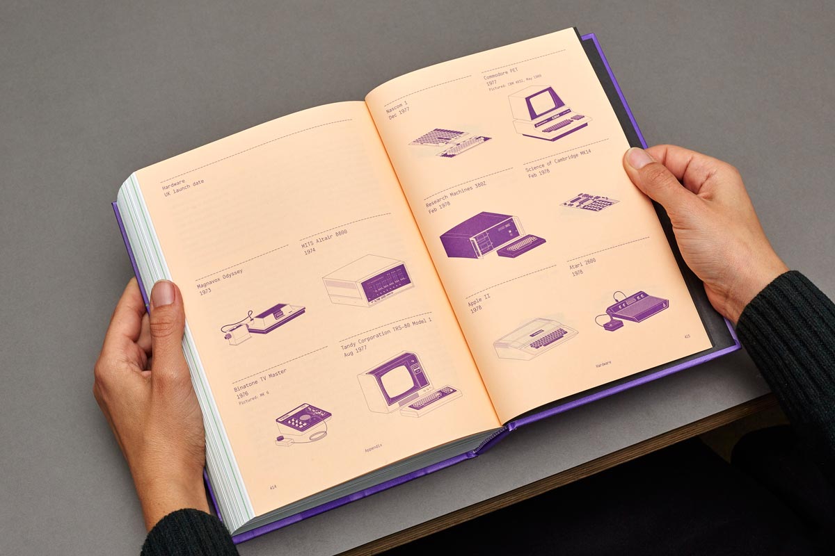
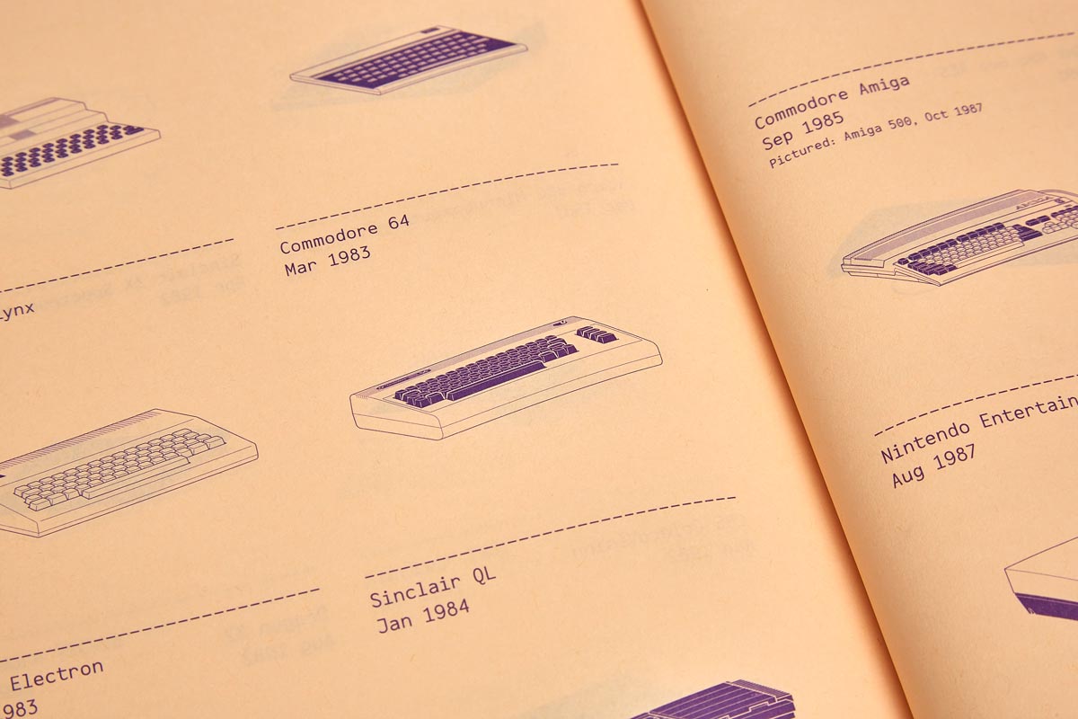
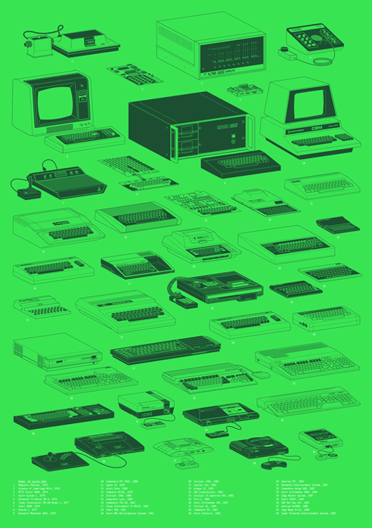
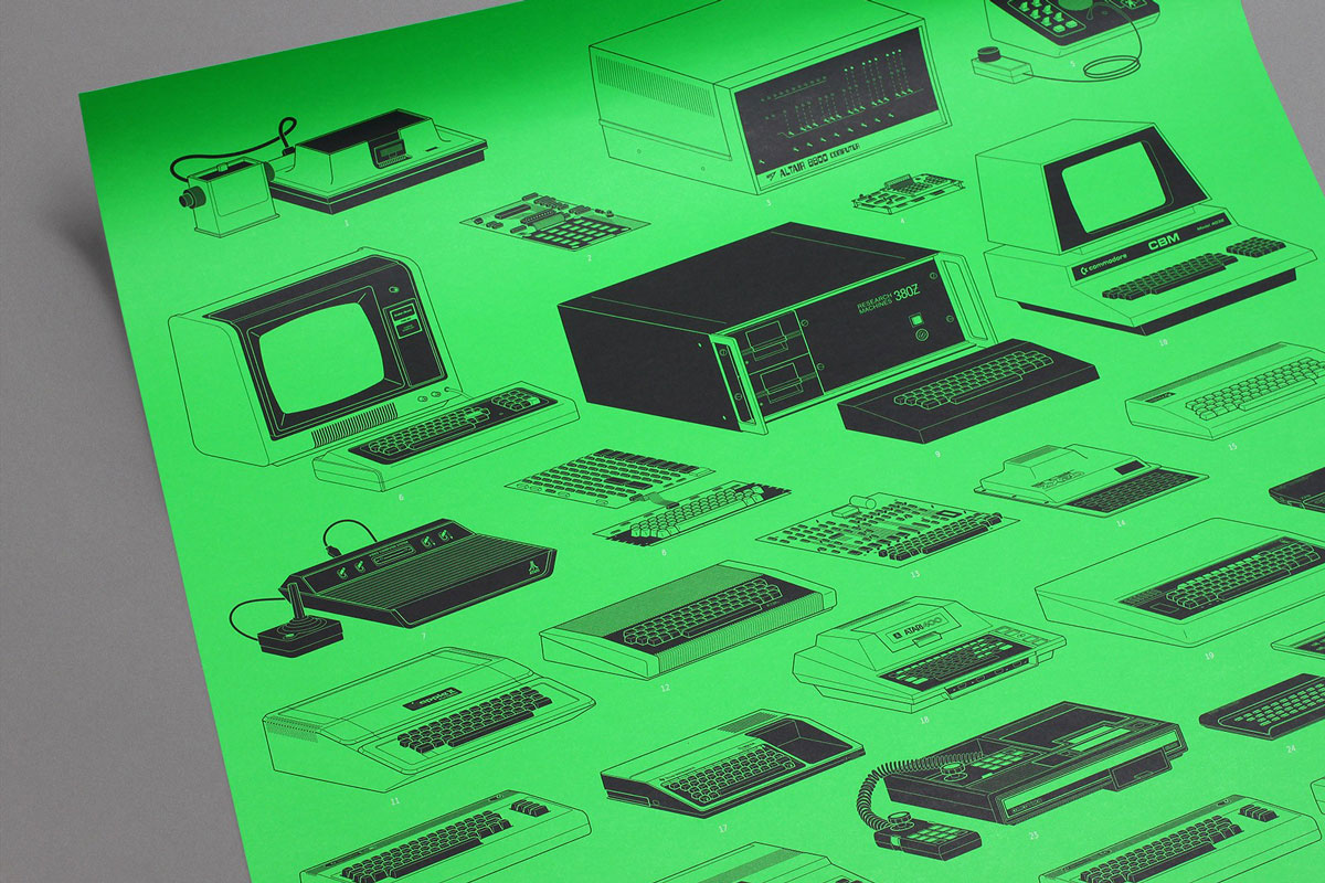
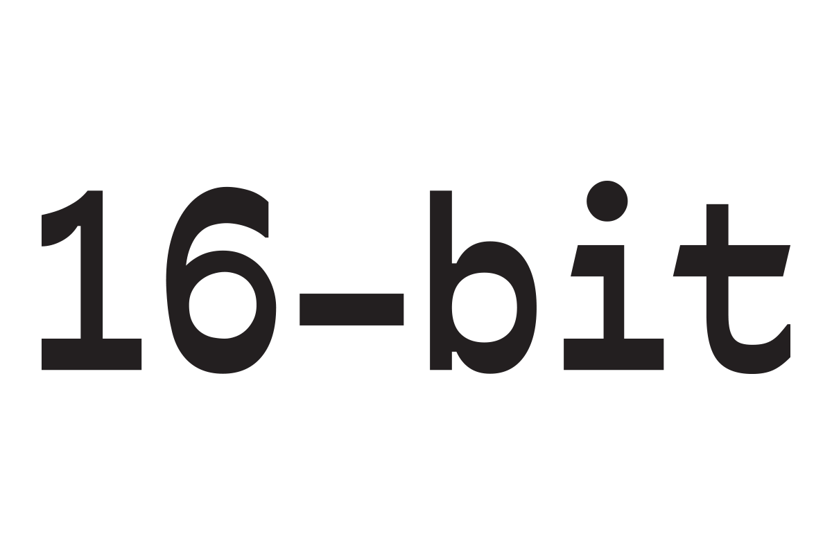
The interviews were constantly referencing hardware, to the point that it became useful to include a visual glossary listing the equipment of the period. It was a demanding task, resulting in 40 computers and consoles illustrated in great detail. The drawings bring an encyclopedic touch to offset the subjectivity of the personal accounts, but also satisfy a geek interest in gadgetry. Suitably, they ended up as a poster reminiscent of subject-specific prints – posters cataloguing types of cheese, knots, or dog breeds. The illustrations cover the period until 1992, when 16-bit consoles became the norm and the balance of power shifted to United States and Japan, marking the end of the Britsoft years.